A new way of drawing boxes in the terminal (possibly)
I get a kick out of being creative within the limitation of the terminal. I may even have come up with with an entirely new way of drawing boxes in the terminal. As bizarre as that sounds.
Boxes in the terminal are not new. Rich is full of them, but they predate Rich by a long time.
CLI apps will typically use box drawing characters to build boxes out of unicode characters. There are characters for vertical lines, horizontal lines, corners, and cross pieces. With a mixture of regular, heavy, and double lines. Even rounded corners. They work like lego: throw them together in the right order and you can display exotic things such as panels and tables at the command prompt.
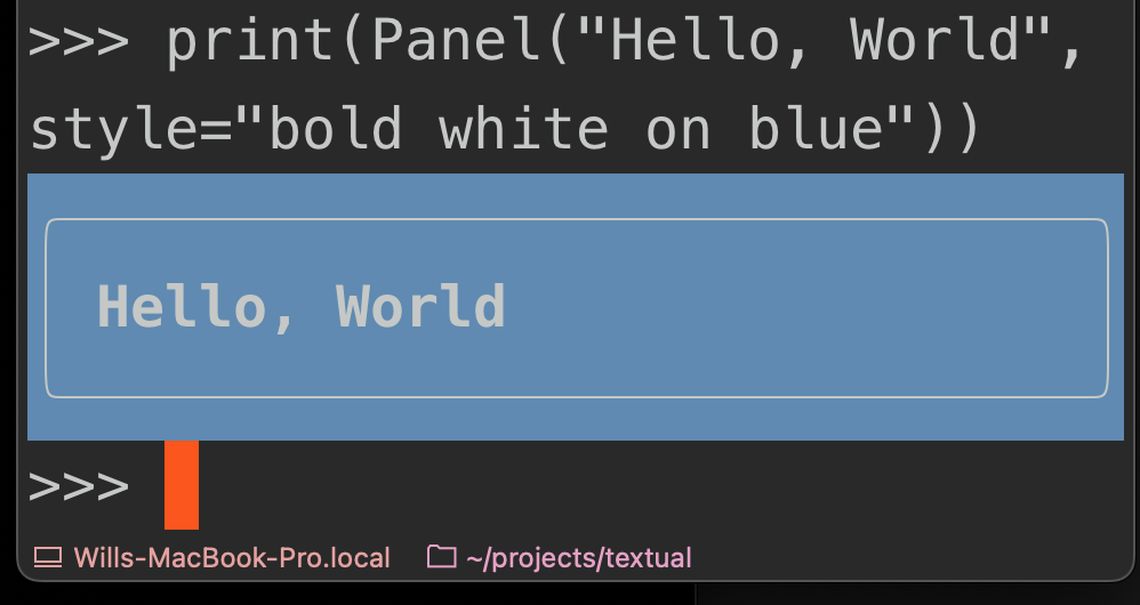
But there is a problem. Look what happens when you set a background color:
The background color leaks outside of the border line. It's easy to see why this happens. I've blown up a small box in this sketch:
Each character in a terminal has exactly 2 colors. No more, no less. There is a background color and a foreground color. Consequently you can't set the color inside of the border independently of the color outside of the border. So background colors are always going to bleed outside of the apparent edge.
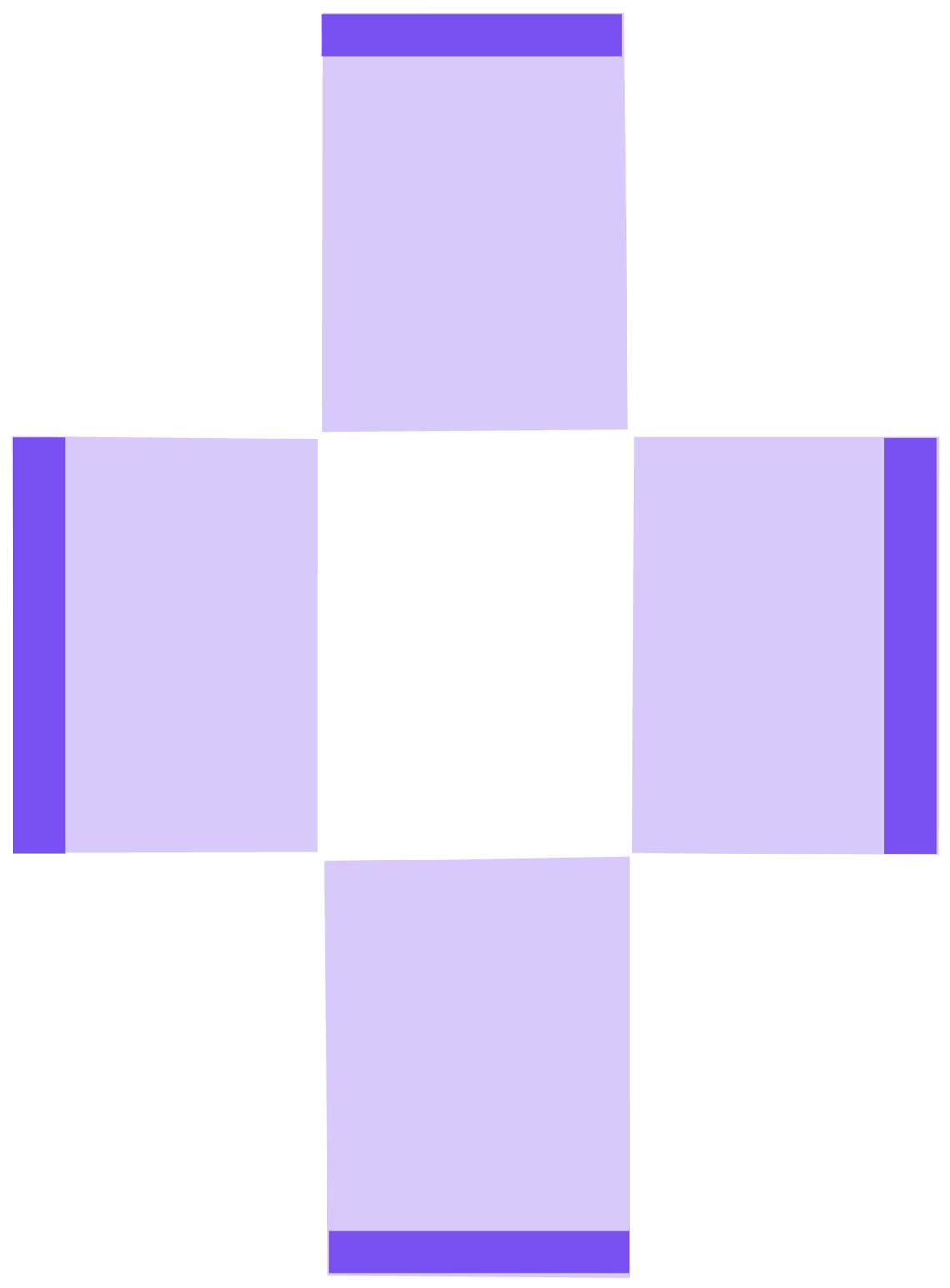
Textual added the ability to use entirely different characters when rendering boxes. Unicode contains one eighth vertical and horizontal blocks which are fantastic for displaying terminal progress bars with apparently higher "resolution" that a single character. But they weren't great for borders. You can see why here:
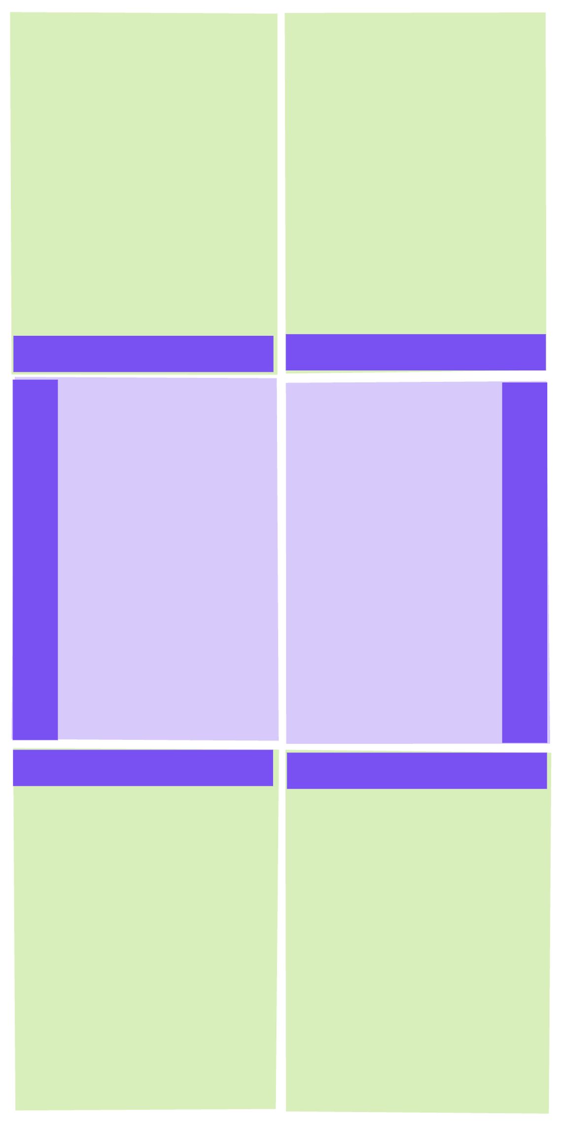
No corners pieces. Darn. Without corners it is not possible to render a full box with independent inside and outside colors.
Turns out I was wrong. There is. I don't know why it didn't occur to me before. Have another look at the image above. It's like one of those irritating puzzles. Make a box with only those 4 characters (you can create copies and change colors). Give it a shot. I'll wait.
Boxes all the way down
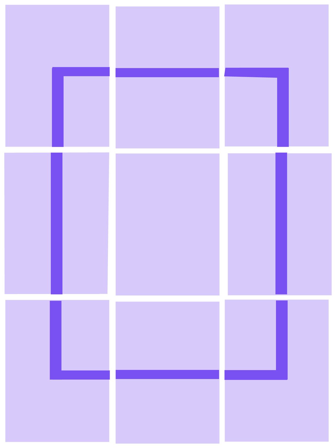
Here's the solution:
A box with independent inside and outside colors which doesn't violate the "two colors per character rule". It's easy to imaging how you can extend this box to larger sizes, and surround other text.
It's been possible to display boxes like this for a while (literally decades). But I haven't seen it done like this in the wild. How can that be possible? Surely every combination of unicode characters in the terminal has been tried?
If no prior art emerges, I'm calling this technique "McGugan Boxes". I'd like "Inventor of McGugan boxes" to be inscribed on my tombstone.
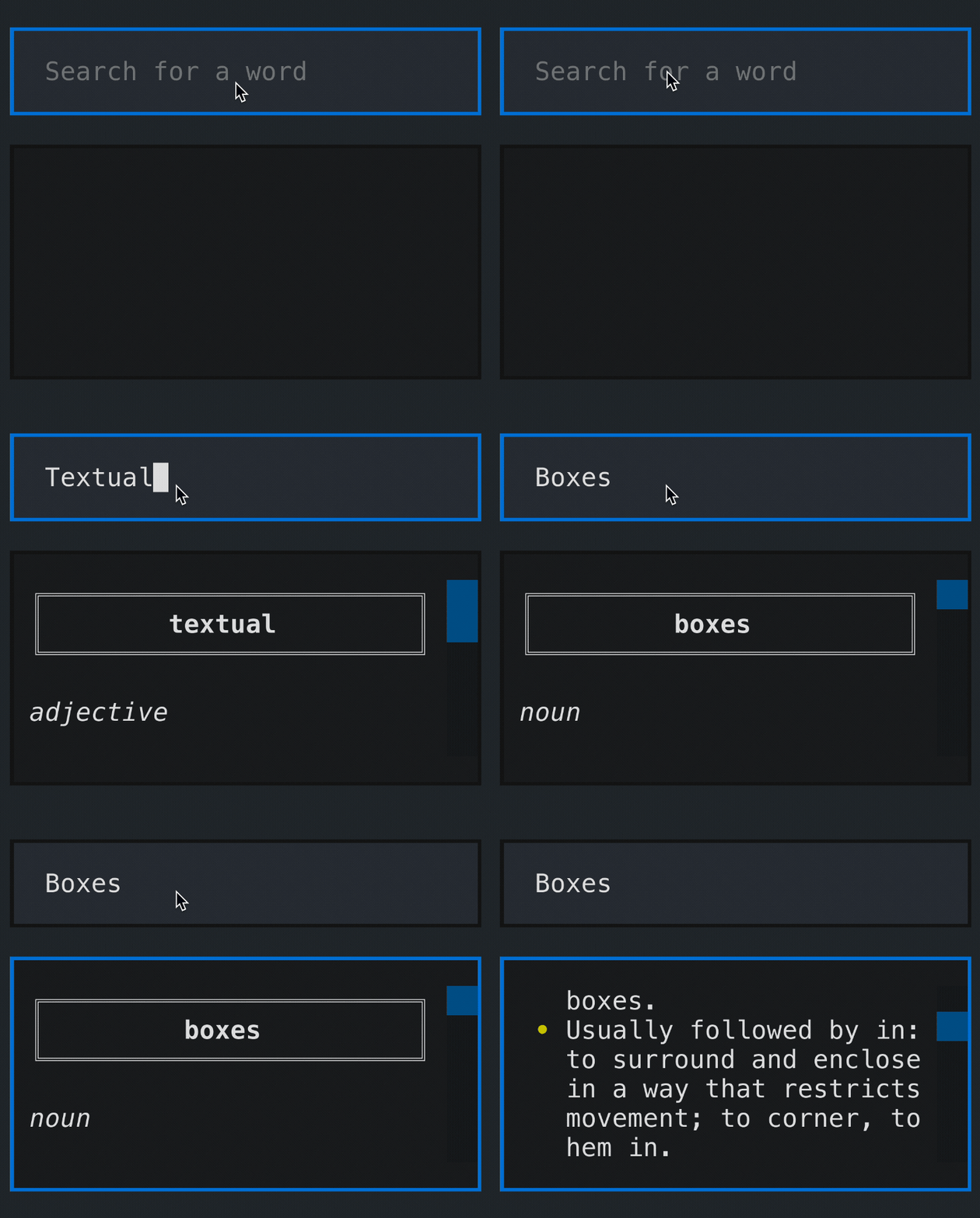
Here's an example of McGugan Boxes being used in a Textual demo:
Textual update
The next release of Textual will land on 10/24 (24th of October in US format, or "1KB day"). Featuring McGugan boxes and amazing docs.
Mark the date or join the mailing list on Textualize.io.
This technique is similar to the usage of MouseText, a character set for the Apple //e designed to display buttons (both normal and inverse colored), rectangles, progress bars and the like in text mode. MouseText did make it into the Unicode standard in the 0x1fb00 block, but there are very few fonts that include it.
Do you have this in a working font that can be downloaded ?
Works with just about any font.
can we not keep putting graphical things into a text terminal instead of just making it easier to make graphical things
Who's this "we" you speak of? I'll do as I please, thanks.
ni - quit hatin - guis universally suck and will never be better no matter how much work u put in because of the amount of control they want
Typescript, not Python, but still relevant: checkout the borders named
vNearandhNearat:border sets reference
This is a screenshot from the border sets reference script of a new library called Stacka I just made public:
stacka
The names
vNear/hNearhave a flimsy mnemonic symmetry withhalfSolidNear/halfSolidFar, but they are generic and have no story. “McGugan Boxes” is way better. I would rename them in the Stacka library if you approve, that is if you do not mind.middle-ages
Be my guest!
Thanks for the names! At:
https://github.com/middle-ages/stacka#borders-1
Between
beveledandhDoubleyou will findhMcGuganandvMcGugan.Note to future linguist from the dictionary company: congratulations on finding one of the earliest recorded usage of the word! Assuming at least 10 years have gone by, you can now add it to your dictionary.
borders reference
Love it! ❤️
lol, drawing boxes like that is nothing new. i published a terminal emulator / tui dev framework in june that uses the same technique to draw windows, and i'm definitely not the first to do it either.
Show me a screenshot. I don’t think you read the full post. Lol.
go to my website and download UltraTerm Demo, then enter 'UltraOS' into the shell to launch the window manager demo. there you can see that the windows are drawn using box drawing characters with the same technique you described.
in my TUI framework, windows and boxes can use a variety of styles. in the UltraOS demo applet, the windows are using box style 'WindowB' which uses Left Half Blocks instead of One Eighth Blocks (because eighth blocks unfortunately render with gaps between the cells in many font faces).
you can download my terminal emulator UtraTerm here: https://cybergem.net/ultraterm/
here's a video of one of the window styles from April (before i released the demo): https://twitter.com/UltraTerm/status/1512746595946618880
here's a video of the UltraOS window manager demo: https://twitter.com/UltraTerm/status/1572067332687826944
here's a screenshot of the C++ code that sets the box/window drawing glyphs: https://twitter.com/UltraTerm/status/1589258568884449281
BTW i'm not interested in being given credit for this, just letting you know that it's been done before (and i'm not claiming i'm the first to do it, either).
Your project is very cool, but that's not quite the same technique.
thanks!
in what way is it not the same technique? all of the Window styles use partial block glyphs to draw the window borders, without using any box corner glyphs. is that not the crux of what's described in your post?
the only difference is that the title bar (top of the box) uses a full block glyph, so it would look like a window rather than a box.
I'm not sure if I've ever seen this with 1/8th width Unicode characters, but the same concept has been used with the half-width characters, stacking them in the exact same orientation, since the DOS days, making chunky window borders. Your use of the newer, thinner, glyphs is much nicer looking and more versatile. Well done!
The font I am using in my terminal (IBM Plex Mono) has the quarter width lines but not the eighth width lines. But this is in Windoze Terminal so I'll try it again later on a real computer. Great technique though, I'll be using it.